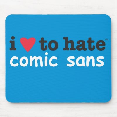
An Image is worth a thousand words. If you are someone how like the phrase in this photo, I am sure you are going to love the “Kill Comic Sans” game. Express your hard feelings for comic sans by shooting the floating word.
My take on this particular font: I don’t like it because it looks sloppy and informal. As a map designer, I’ve never found it suitable for my projects. It isn’t bad. It is just not for professional use.
