I was really impressed by this New Mexico Soap. New Mexico is a soap making company. The photo above is of a product called ‘lather as you learn’ state shaped bar. They have soaps in the shapes of all the states. However, I still wonder why they make Texas shaped soap with a label of New Mexico on it!!
Now that my both GIS classes are over this weekend was ‘assignments free’ after quite a while. I watched couple of movies, went for shopping, had delicious dinner, spent some time with my husband and played United States Map Puzzle. That’s right, played map puzzle for fun. Contrary to my initial thought it was quite a challenge to recognize the states from their shape. Of all the states, California, Texas, and Florida has easily recognizable shape.
I wondered how all these states got their boundary. My search for my question gave me a book- How the States got their shape, by Mark Stein. Here is the book’s first introductory page.
Now I really want to know, why West Virginia has a finger creeping up the side of Pennsylvania and why Texas and California are so outsized?!
My second map for the final project is “Contribution of Pennsylvania to Pediatric Healthcare’. I wanted to use Network Analysis Method to show proximity of each health center but didn’t work out in the time constrain and available data.
I like to thank my husband at this point to help me get required data from the AmericanAcademy of Pediatrics and FREIDA. I used services and catchment provided by tertiary healthcare centers as the outcome. At first glance I thought it was such a disproportionate distribution of the healthcare in the state. But then my favorite census data came to the rescue! After applying the healthcare catchment and pediatric population data for each county to the map, it became obvious that the tertiary healthcare system in Pennsylvania is strategically placed. More than 75% of total pediatric population is covered in 60miles proximity of one or other health center. The programs are CHIP, WIC and hospitals are CHOP puts Pennsylvania as a leader in pediatric healthcare.
Finally, I am done with all atlas pages of final project of my cartography class. Here is my first atlas page on ‘Urbanization in Pennsylvania’.
I am really thankful to Hershey Library for keeping those awesome books on history of Pennsylvania. I had more than my regular dose of reading the history while working on this. It was a challenge to present census data in useable format on the atlas. Gathering and managing data in ArcMap was most tedious job I found during working on it. This project gave me huge hands on experience with ESRI software and I got chance to know the history of Pennsylvania. My respect for Pennsylvania and its history has increased by a huge amount after working on this project.
Berkeley Pit assignment was to exercise terrain analysis and 3D modeling in ArcScene. I had given to make Elevation map, Hillshade map, and Orthographic view of Berkeley Pit. This was the first project dealt with Digital Elevation Model.
Spatial Analyst tool is a great feature of ArcGIS. Playing with all 3D tools is fun and you get amazing results. Arcscene allows overlying layers and making it 3D. Sometime it gets buggy. The thing I always have problem with is draping the aerial images. I would love to have some suggestions or tips regarding that. But for now enjoy my poster!
I created this poster of YellowstoneNational Park & Supervolcano showing relief features and few important location of the park. This project interested me a lot as in past I had been on some geographic field visits to similar geographical locations during my college years and it was very fascinating to me. I included the location and timeline of past eruption of volcano and general history of the area.
Finding the data was the real task in this project. Searching for authentic base map, digitizing park boundary and caldera rim, creating new feature class, etc made this project a challenge. In the end, I was very happy with the outcome. I hope you all agree!
Working on Harrisburg Pub Crawl project was very interesting. This was my first contact with any information about pub and alcohol!! Overall it was pretty simple project but I had to do more of base research and concept research for this. Though choosing the theme for the map was little tactic. For the path and the pub location I used one of the base maps from ArcMap. I ended up using beer mug as my theme for the project.
I tried to give more visual impact to the map rather than putting too much text information. To lighten the mood of the theme I used lots of cartoons while projecting the information. ‘
P.S: It was a good opportunity for me to learn about pubs and alcohol!! ;)
The very first assignment in cartography class was to make a flyer for collage’s study abroad program. It was specially to get hands on PowerPoint and Gimp (graphic software). But we had to add one map which should be created in ArcGIS.
(Map for Study Abroad Poster made in ArcMap.)
(Finished product-Flyer for HACC's study abroad program.)
This project taught that graphic skills are must needed talent for mapmaking. We learned to plan a layout, to balance page with elements, to conceder map purpose and audience, etc. It was good start and I enjoyed that project.
Ahmedabad is the largest city in state Gujarat, India with a city population of about 4 million. It is the seventh largest city and eighth largest metropolitan area of the country. The video below shows the history of the development of the city from its foundation in 1411 AD to present day.
The video contains maps that are scaled models of spatial concepts of the city. Maps depict transition and process of urbanization in city. It also tells history of cartography and achievements in the branch in India. All the maps shown in video are truly admirable.
I always heard that practice makes a man perfect but now I finally believe in it while working on my final project. For every new function and tool I learned in class, I wondered how helpful they are and how easier the map making will be with them. Now, while working on my project I can realize that there is a big difference in just knowing tools and actually using them and working with them. Very basic functions like joining attributes, labeling, symbolizing, etc. can take hours and hours. Another thing I noted is that the process of collecting the raw data for making a map is more challenging task than actual process of making the map. In the beginners’ class making maps from provided processed data feels like “cake walk” but now I certainly feel the amount of the work that needs to be put in for finding that data.
The more error you get the more you learn. And to get more errors you have to keep playing with keys. I hope after making hundreds of thousands maps I will be a perfect map maker!
Lately, in my GIS classes, I have been working on ArcScene. I am really impressed with its animation tool. Animated map is undoubtedly superior to a plain map on screen or paper. With map animation, we can easily show spatial and temporal changes.
While there are numerous examples of animated map you can find on web, here is one I like to share with you. This is a short video showing American History-Growth of a Nation. Narration and animation gives a different dimension to the maps. Enjoy the video!
I think it is time to post some core theories- Central place theory (CPT) and Voronoi diagram. So be ready to give your brain quite an exercise!
Originally developed by Walter Christaller in 1933, Central place theory is the idea that urban locations are arranged spatially in a pattern of hexagons that are nested based on the size of the urban location. Rather explaining whole theory, I like to put in front of you a short video summarizing the concept.
This concept has been called Unrealistic. However, it is able to imitate existing urban system (i.e by applying K=3, K=4, and K=7 method). CPT attempts to illustrate how settlements locate in relation to one another, the amount of market area a central place can control, and why some central places function as hamlets, villages, towns, or cities.
It is also one of the most widely studied models of retail location and market area patterns.
While the CPT is a concept on spatial- temporal relationship, the Voronoi Adjacency graph could be valuable tools for the manipulation of spatial adjacency relationship in a computer environment for a variety of application.
One of the articles I had studied few years back illustrated retail location and market area pattern by using higher-order Voronoi diagrams. These diagrams construct market areas based on the assumption that consumers choose from a set of k (where k = 1 to n number) nearest centers of the same hierarchical level. The appropriate market areas are given by the order-k Voronoi design. If I am remembering it right, it is the article named ‘Relaxing the nearest centre assumption in central place theory’.
Here is the Voronoi-Style US Maps with a current location of state capitals and simulated new boundaries constructed so that every place within the polygon is nearest to its capital city. (special thanks to my friend Kristi who cared to find these great maps in the first place. Here is Kristi's Posts - "Voronoi Diagramming and GIS" and "Voronoi II")
(Unchanged map)
(Voronoi-style map with new boundaries)
(Map with current political state boundaries overlaped with Voronoi-style boundaries)
Looking for some cartography theme wallpapers? The wallpaper blog has tons of cool wallpapers. The description for World Map Wallpapers in this blog says that those are almost accurately measured maps. I found few wallpaper really beautiful and best suited for my desktop.
Here is one of the video from ted.com showing excellent example of projections using maps and multimedia. I have bias against this one because it includes my home country ;)
Authentic data is a key element in making good, genuine map and Surveying is a common method of collecting primary data from the real world. But in GIS, getting mappable data is a multi-step procedure.
This process bores me to death. I hate working on making usable data rather then making maps! But then, it is a part of cartographer’s work. So I guess, I should start enjoying it like I enjoy the creative part of mapping!
Here, you can see how miserable the life would be if one is engage in only data collection. I have lots of compassion for those Google Guys in video!
I have found this wonderful blog on Free Geography Tool. This blog has information and links of bunch of freeware/geographic tools. You can manipulate geographic data including GPS, GIS, Google Earth etc. This one also covers a wide variety of topics related to geospatial technology. I specially noticed Software category which combines different free data visualization tool. Almost all of them are freeware. I thought it will be nice to share with all of you.
Making maps involves as much art as much it involves the science. Making a painting involves multiple aspects like dimension, color choice, element size, proportion, spacing and presentation. Does any of these sound familiar to my fellow cartographers? Yes, these are kind of the same basics we use while making a map. I have passion for canvas painting and I can very well impose the same while I am making a map. I think we won’t be wrong if we call ourselves cartographers and artists!!
In any map projection, some distortions are acceptable. But when you purposefully tweak the equations to produce total messed up maps, then the outcome may seem interesting.
Robinson
Bonne
The two above and many other Accidental map are created by Andy Woodruff, Software developer at Indiemapper.
There was a time during by bachelors, I used to make geographic framework manually. The process included tedious geographical calculations, framing a projection, and tracing map with a pantograph. It was a week long exhaustive process. Attached are few of the work sheets I did during bachelors.
Mercator's Projection
Polar Zenithal Equal Area Projection
Bonne's Projections
And now with blessings of ArcGIS, I can do this with click of a button!
You might ignore a traffic sign but would your dare to speed up if you see a kid playing in the middle of a road? Optical illusions of a child are on some of the roads of Vancouver to get people to slow down. It will be on the experimental basis for a week. Is this a practical solution of the problem? What is your view on this?
Maps can be made for both visible and non visible data. We have seen non visible features like wind and temperature on map many a times in weather News. Now, here is a map of Wireless Network. A video created by Designer Timo Arnall projects wireless networks of WiFi, Bluetooth, etc. in the physical world. It is represented as circles with WiFi networks or portable gadgets as the epicenter.
“Habitar is a walk through new emerging scenarios in the city. It is a catalogue of ideas and images from artists, design and architecture studios, and hybrid research centers. Together they come up with a series of potential tools, solutions and languages to negotiate everyday life in the new urban situation”, as described by them.
As I said before, there is a very simple logic behind it. Geographers use this method of showing invisible maters with physical objects frequently in their work. Then, what’s the point to hype this just by giving a fancy name and calling it “New Concept”?
I always knew that this could be the reason!! but recently found this map- Driving is why you are fat! The map shows statewise how people get to work everyday and what is state's obesity ranking. Ranking is done for 50 states plus District of Columbia.
A map analyst inside me couldn’t help noticing a weird ranking system that is #1 in obesity is the place with minimum obese. The other thing I bumped into is some of the states have high drive rank as well as high walk/bike rank (eg: AL, MS, LA, OK), wouldn’t the higher rank for walking and biking mean a lower rank for driving as ranks are given by percentage of total population of state. I even don’t like the dull boring color combination used in the map!
Still, it is a decent map even if the details aren’t completely logical. The idea of block style presentation of statistic is nice for the evenness. This way smaller size state can also be focused similarly. Although the relation between the obesity and mode of communication is very obscure, this kind of map can be made for obesity in relation to food consumed, average Income or general economy. However, this particular map gives good representation of the different modes of transportations.
Do you remember the word ‘Compass’? Do you remember how does it look like? Yes, it is the object with magnetized pointer used for traveling a long long time ago. It required a separate calculation of distance and time. The measurement tools were crude and inaccurate. Thus, the process was very complicated.
Then the satellite navigation system is introduced. An easy, quick, and convenient way to reach your destination. A world knows it as GPS – Global Positioning System. The system was only made operational in 1995, but has already become so omnipresent that we can no longer live without it.
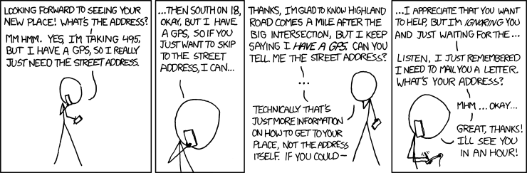
This comic caught my eyes.
I know we all are familiar with applications such Sat Nav and tracking devices, but there is much, much more. Surveying, Geotagging, Map making, Geofencing, object tracking, road; maritime and air transport are to name a few. GPS system is widely used as to track what so ever. The best application I could think of is to track my brother’s steps and tell it to daddy to be his pet!
I was reading a column “What next for the GPS” where I found that researchers envision a sort of electronic post-it note on your phone to enable stores and restaurants to attract wireless customers how are strolling in their neighborhoods. That’s cool, isn’t it? I will get all current schemes and deals as I pass through a shopping center!
In the words of tech futurists: “You’re likely to see more new uses soon thanks to miniaturization, higher accuracy and falling prices". All in all we wouldn’t want to live in world without GPS anymore. I mean, if you are looking for absolute location, relative movement and time transfer then GPS is your answer.
As I begin to blog, I have very little clue as what different things I can post.
While browsing, I came across quite interesting article which explains the Evolution of Cartography. This article on the development of geo-spatial informationbriefly focuses on very first Cylindrical Projection developed by Gerardus Mercator in 16th century to eventually transformation of paper maps into digital form by GIS emerged in 80's and 90's. It also gives inkling to 'what could be the next'. Anyone who is related to 'Map Making' will find it interesting. I really liked it.
Now I am going to spend some time on reading "how to blog"!!! ;)