So proud of you honey!
May 30, 2015

October 10, 2011
The "Kill Comic Sans" Game
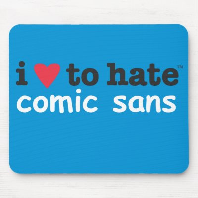
An Image is worth a thousand words. If you are someone how like the phrase in this photo, I am sure you are going to love the “Kill Comic Sans” game. Express your hard feelings for comic sans by shooting the floating word.
My take on this particular font: I don’t like it because it looks sloppy and informal. As a map designer, I’ve never found it suitable for my projects. It isn’t bad. It is just not for professional use.
September 16, 2011
Changes in Latitude, Changes in Attitude
I came across this impressive song written and sung by Jimmy Buffett. The title is "changes in latitude changes in attitude" which reminds me of Physical Geography lesson on how latitudinal difference affects the climate and regional climate affects agriculture, shelter, clothing and lifestyle in general. Oh no no, the song is not about those lessons. It's a very catchy song and I really liked it!
Here are the lyrics (the dialect is kinda hard to understand at first!)
I took off for a weekend last month
I took off for a weekend last month
September 13, 2011
There shouldn't be one 'officially sanctioned' view of our world!
I am working on a presentation for Map projection and Coordinate System. While I was working on the assignment, I suddenly remember very interesting video explaining projections one of my classmates shared with us. Here it is..
Every time I play this clip, I couldn't stop laughing! (my cheeks are hurting right now) Now, though it is as boring as it sounds, Let me get back to my powerpoint!!
January 22, 2011
Defining Success in the Geospatial Industry
Defining Success in the Geospatial Industry, a column in latest issue of magazine-ArcUser winter 2011, released the Geospatial Competency model. This model is designed using a variety of skills required to develop a successful career in the geospatial technology field.
I mention this because currently I am working on my interpersonal and communication skills. Yes, preparing myself for Job interviews. It is said that soft skills are harder to acquire then technical skills. But I believe that soft skills are an inherent part of one’s personality and nobody is perfect but if you make a determined effort you can overcome any deficiency.
I am learning to find my limitations in area of soft skills. I have started spending my time watching live interviews, reading more books, and preparing for FAQ in job interviews. I am trying my best to crack the interview (whenever I get one! J).
December 12, 2010
Texas is not New Mexico!

I was really impressed by this New Mexico Soap. New Mexico is a soap making company. The photo above is of a product called ‘lather as you learn’ state shaped bar. They have soaps in the shapes of all the states. However, I still wonder why they make Texas
How the state got their boundaries?
Now that my both GIS classes are over this weekend was ‘assignments free’ after quite a while. I watched couple of movies, went for shopping, had delicious dinner, spent some time with my husband and played United States Map Puzzle. That’s right, played map puzzle for fun. Contrary to my initial thought it was quite a challenge to recognize the states from their shape. Of all the states, California , Texas , and Florida

I wondered how all these states got their boundary. My search for my question gave me a book- How the States got their shape, by Mark Stein. Here is the book’s first introductory page.

Now I really want to know, why West Virginia has a finger creeping up the side of Pennsylvania and why Texas and California
Second atlas page of final project of mine.
My second map for the final project is “Contribution of Pennsylvania to Pediatric Healthcare’. I wanted to use Network Analysis Method to show proximity of each health center but didn’t work out in the time constrain and available data.

I like to thank my husband at this point to help me get required data from the American Academy Pennsylvania Pennsylvania
One of the two final project map of mine.
Finally, I am done with all atlas pages of final project of my cartography class. Here is my first atlas page on ‘Urbanization in Pennsylvania

I am really thankful to Hershey Library for keeping those awesome books on history of Pennsylvania Pennsylvania Pennsylvania
December 5, 2010
Berkeley Pit In Butte, Montana
Berkeley Pit assignment was to exercise terrain analysis and 3D modeling in ArcScene. I had given to make Elevation map, Hillshade map, and Orthographic view of Berkeley Pit. This was the first project dealt with Digital Elevation Model.

Spatial Analyst tool is a great feature of ArcGIS. Playing with all 3D tools is fun and you get amazing results. Arcscene allows overlying layers and making it 3D. Sometime it gets buggy. The thing I always have problem with is draping the aerial images. I would love to have some suggestions or tips regarding that. But for now enjoy my poster!
December 4, 2010
Yellowstone National Park
I created this poster of Yellowstone National Park & Supervolcano

Finding the data was the real task in this project. Searching for authentic base map, digitizing park boundary and caldera rim, creating new feature class, etc made this project a challenge. In the end, I was very happy with the outcome. I hope you all agree!
Harrisburg Pub Crawl
Working on Harrisburg Pub Crawl project was very interesting. This was my first contact with any information about pub and alcohol!! Overall it was pretty simple project but I had to do more of base research and concept research for this. Though choosing the theme for the map was little tactic. For the path and the pub location I used one of the base maps from ArcMap. I ended up using beer mug as my theme for the project.


I tried to give more visual impact to the map rather than putting too much text information. To lighten the mood of the theme I used lots of cartoons while projecting the information. ‘
P.S: It was a good opportunity for me to learn about pubs and alcohol!! ;)
Study Abroad Poster
The very first assignment in cartography class was to make a flyer for collage’s study abroad program. It was specially to get hands on PowerPoint and Gimp (graphic software). But we had to add one map which should be created in ArcGIS.

(Map for Study Abroad Poster made in ArcMap.)

(Finished product-Flyer for HACC's study abroad program.)
December 1, 2010
Mapping urban transition of Ahmedabad
Ahmedabad is the largest city in state Gujarat , India
The video contains maps that are scaled models of spatial concepts of the city. Maps depict transition and process of urbanization in city. It also tells history of cartography and achievements in the branch in
November 30, 2010
Practice is a key of perfection!
I always heard that practice makes a man perfect but now I finally believe in it while working on my final project. For every new function and tool I learned in class, I wondered how helpful they are and how easier the map making will be with them. Now, while working on my project I can realize that there is a big difference in just knowing tools and actually using them and working with them. Very basic functions like joining attributes, labeling, symbolizing, etc. can take hours and hours. Another thing I noted is that the process of collecting the raw data for making a map is more challenging task than actual process of making the map. In the beginners’ class making maps from provided processed data feels like “cake walk” but now I certainly feel the amount of the work that needs to be put in for finding that data.
The more error you get the more you learn. And to get more errors you have to keep playing with keys. I hope after making hundreds of thousands maps I will be a perfect map maker!
November 21, 2010
Animated Maps
Lately, in my GIS classes, I have been working on ArcScene. I am really impressed with its animation tool. Animated map is undoubtedly superior to a plain map on screen or paper. With map animation, we can easily show spatial and temporal changes.
While there are numerous examples of animated map you can find on web, here is one I like to share with you. This is a short video showing American History-Growth of a Nation. Narration and animation gives a different dimension to the maps. Enjoy the video!
November 7, 2010
Central Place Theory and Voronoi Diagram.
I think it is time to post some core theories- Central place theory (CPT) and Voronoi diagram. So be ready to give your brain quite an exercise!
Originally developed by Walter Christaller in 1933, Central place theory is the idea that urban locations are arranged spatially in a pattern of hexagons that are nested based on the size of the urban location. Rather explaining whole theory, I like to put in front of you a short video summarizing the concept.
This concept has been called Unrealistic. However, it is able to imitate existing urban system (i.e by applying K=3, K=4, and K=7 method). CPT attempts to illustrate how settlements locate in relation to one another, the amount of market area a central place can control, and why some central places function as hamlets, villages, towns, or cities.
It is also one of the most widely studied models of retail location and market area patterns.
While the CPT is a concept on spatial- temporal relationship, the Voronoi Adjacency graph could be valuable tools for the manipulation of spatial adjacency relationship in a computer environment for a variety of application.
One of the articles I had studied few years back illustrated retail location and market area pattern by using higher-order Voronoi diagrams. These diagrams construct market areas based on the assumption that consumers choose from a set of k (where k = 1 to n number) nearest centers of the same hierarchical level. The appropriate market areas are given by the order-k Voronoi design. If I am remembering it right, it is the article named ‘Relaxing the nearest centre assumption in central place theory’.
Here is the Voronoi-Style US Maps with a current location of state capitals and simulated new boundaries constructed so that every place within the polygon is nearest to its capital city. (special thanks to my friend Kristi who cared to find these great maps in the first place. Here is Kristi's Posts - "Voronoi Diagramming and GIS" and "Voronoi II")

(Unchanged map)

(Voronoi-style map with new boundaries)

(Map with current political state boundaries overlaped with Voronoi-style boundaries)
October 23, 2010
World Map Wallpapers
Looking for some cartography theme wallpapers? The wallpaper blog has tons of cool wallpapers. The description for World Map Wallpapers in this blog says that those are almost accurately measured maps. I found few wallpaper really beautiful and best suited for my desktop.

(Notice the Lat-Long on Map)

(All that symbols makes it unique)
October 21, 2010
Economic Growth of The World.
Here is one of the video from ted.com showing excellent example of projections using maps and multimedia. I have bias against this one because it includes my home country ;)
October 12, 2010
Data Collection - A crucial step in map making.
Authentic data is a key element in making good, genuine map and Surveying is a common method of collecting primary data from the real world. But in GIS, getting mappable data is a multi-step procedure.


This process bores me to death. I hate working on making usable data rather then making maps! But then, it is a part of cartographer’s work. So I guess, I should start enjoying it like I enjoy the creative part of mapping!
Here, you can see how miserable the life would be if one is engage in only data collection. I have lots of compassion for those Google Guys in video!
Subscribe to:
Posts (Atom)